From the file. Written for the paper dated November 2012. Opened in the public stacks July 14, 2026.
In an age awash with information, the need to sift through primary sources has never been more critical. Yet, both sides of the political spectrum often employ numbers in a way that serves their narratives rather than illuminating the truth.
The Challenge of Interpretation
Politics today has become a battlefield of statistics. Politicians and pundits alike wield numbers to bolster their arguments, but the interpretation of these figures often reveals more about the interpreter than the data itself. Whether it is economic indicators, unemployment rates, or educational outcomes, the manipulation of numbers can lead to vastly different conclusions, depending on who is doing the interpreting.

"The data can be a double-edged sword; wielded correctly, it can inform, but in the wrong hands, it can mislead."
Take, for instance, the recent debates surrounding unemployment rates. The left frequently touts decreases in unemployment as evidence of a recovering economy, while the right points to labor force participation rates that suggest many have simply given up looking for work. Both sides use numbers to paint their preferred picture of reality, yet neither fully addresses the complexities underlying these figures.

Statistics in the Political Arena
To further complicate matters, the public is often left to decipher complex statistical analyses without the necessary context. A number presented without its background can lead to misconceptions. For example, when discussing poverty levels, the left may focus on the percentage of people living below the poverty line, while the right may emphasize the number of households receiving government assistance. Each narrative has its own merits, yet the selective emphasis can distort the overall picture.

Moreover, the media often plays a crucial role in this interpretative dance. A sensational headline can draw attention to a particular figure while glossing over the numbers that might create a more nuanced view. This tendency is not unique to one side; both left-leaning and right-leaning outlets can fall into the trap of amplifying convenient statistics while ignoring others that could provide a fuller understanding.
Looking at the Bigger Picture
As consumers of news and information, it is imperative that we approach statistics with a critical eye. The numbers themselves are not inherently misleading; rather, it is the context and the narrative constructed around them that can lead to confusion. Engaging with primary sources - original reports, studies, and data sets - can help bridge the gap between raw numbers and meaningful interpretation.
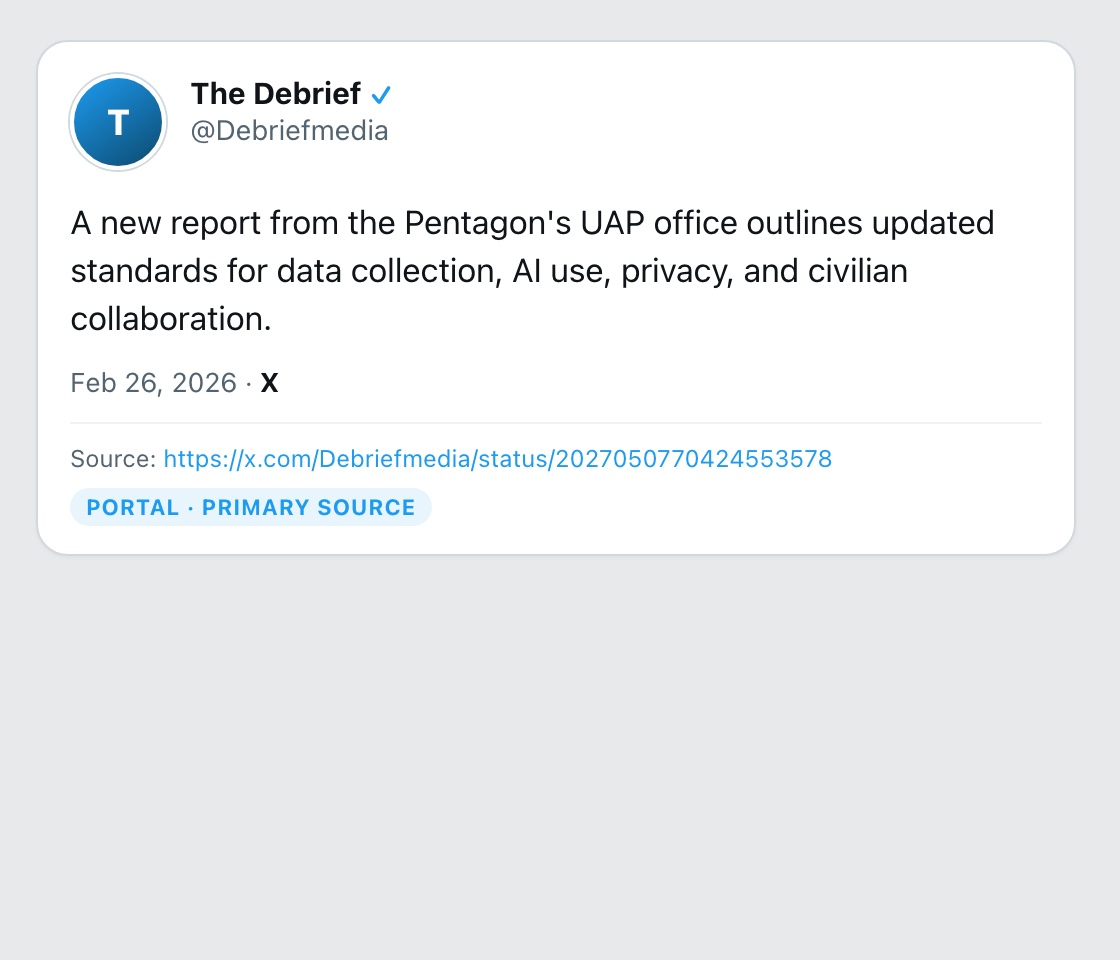
For instance, understanding the methodology behind a study can shed light on its reliability. Was the data collected through a random sample? What were the demographics of the respondents? These questions are vital in determining the validity of any claim based on statistical evidence. When we rely solely on second-hand interpretations of data, we risk falling prey to the biases and agendas of those interpreting it.
Conclusion: A Call for Accountability
In conclusion, both sides of the political aisle must be held accountable for their use of statistics. The left should refrain from celebrating figures that only tell part of the story, while the right must avoid using selective data to instill fear and division. It is crucial for all of us - politicians, journalists, and citizens - to engage with primary sources and challenge the narratives that statistics can create.
Ultimately, the numbers tell a story, but it is our responsibility to ensure that we are reading that story accurately. Only then can we move towards a more informed and constructive political discourse.
✦ ✦ ✦